Logo Design Meaning
I thought my readers might be interested in learning about my process of choosing this design for my logo. When I first began working with the company that designed my website, they said my logo design was the place to start.
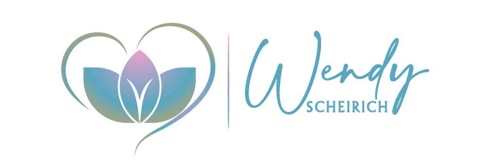
They presented some ideas, and I liked the center image of unfolding leaves that was presented to me as one of my options. The image looked like genitals to me. I thought a genital-looking image was a good one to use since my service is about healthy sexuality. The genitals are at the heart of the root chakra and is the sexual energy center of the body.
When I look at the unfolding leaves image, I see genitals that are gender non-conforming and therefore inclusive of all types and variations of genital appearances and functions. I wish for my service to be applicable and accessible to those with genders and sexual orientations across the full spectrum of possibilities. I wanted the colours to represent diversity and blended possibilities too in terms of both gender and sexual orientation. I included the stereotypical pink and blue colours, and they are blended to represent fluidity. And I requested hints of other colours in the design too to continue the representation of diversity in gender and sexual orientation.
I like the image of leaves unfolding because it reminds me of sexuality being ‘alive’ or ‘a living thing’. I see desire and pleasure unfolding and coming to life when our creative life force erotic energy becomes mobilized by our sexual practices. I see somatic sex education as a field of practice that supports the opening, unfolding, and transmuting of sexual energy that fuels the capacity for many transformations in life. Mobilized erotic life-force energy can produce an increased abundance of pleasure, healing, creativity, happiness, and generalized success in all realms of life. For some, erotic life-force energy connects them to spirit. This phenomenon is often referred to as sacred sexuality.
The heart that surrounds the unfolding image was chosen for a few reasons. First and foremost, as somatic sex educators we are taught about the importance of offering our service with a full heart. And we are taught to be always in loving presence with our clients. Secondly, we are also taught about the importance of our adherence to our guidelines for ethical practice, often called our ‘container’. These practice guidelines keep our service client-focused, predictable, stable, and safe-enough for clients to open themselves up to highly personal and vulnerable states in sessions with us. I thought the heart in my logo design looks like an earnest heart-felt way to represent my service container and practice guidelines.
The line separating the image from my name is there for a reason too. This line is also connected to my guidelines for ethical practice. It represents some of my policies where I have drawn a clear line regarding my service offerings for the same reasons as stated above.
I wanted my first name to be prominent and I wanted the font to be in script form. This represents my intention for my service to be personable and friendly. I chose the depth of colour of the font to represent a blend of boldness and softness. I see somatic sex education as a bold modality. I call myself a brave edge walker. And the modality is also soft in the approach to our practice. We do not have a hard line or hard sell approach with our clients. We invite, coach, and guide our clients gently to empower their choices. And we do not direct them, provide them with expert advice or exert any subtle or overt power-over approaches with our clients.
My appreciation is extended to Appearls web design company who catered to my picky and finicky requests for my logo and website design.
My name is Wendy Scheirich and I am a proud somatic sex educator from Manitoba Canada. Our shared ethos is ‘Pleasure is Healing”.